QS by s.Oliver
Corporate Design
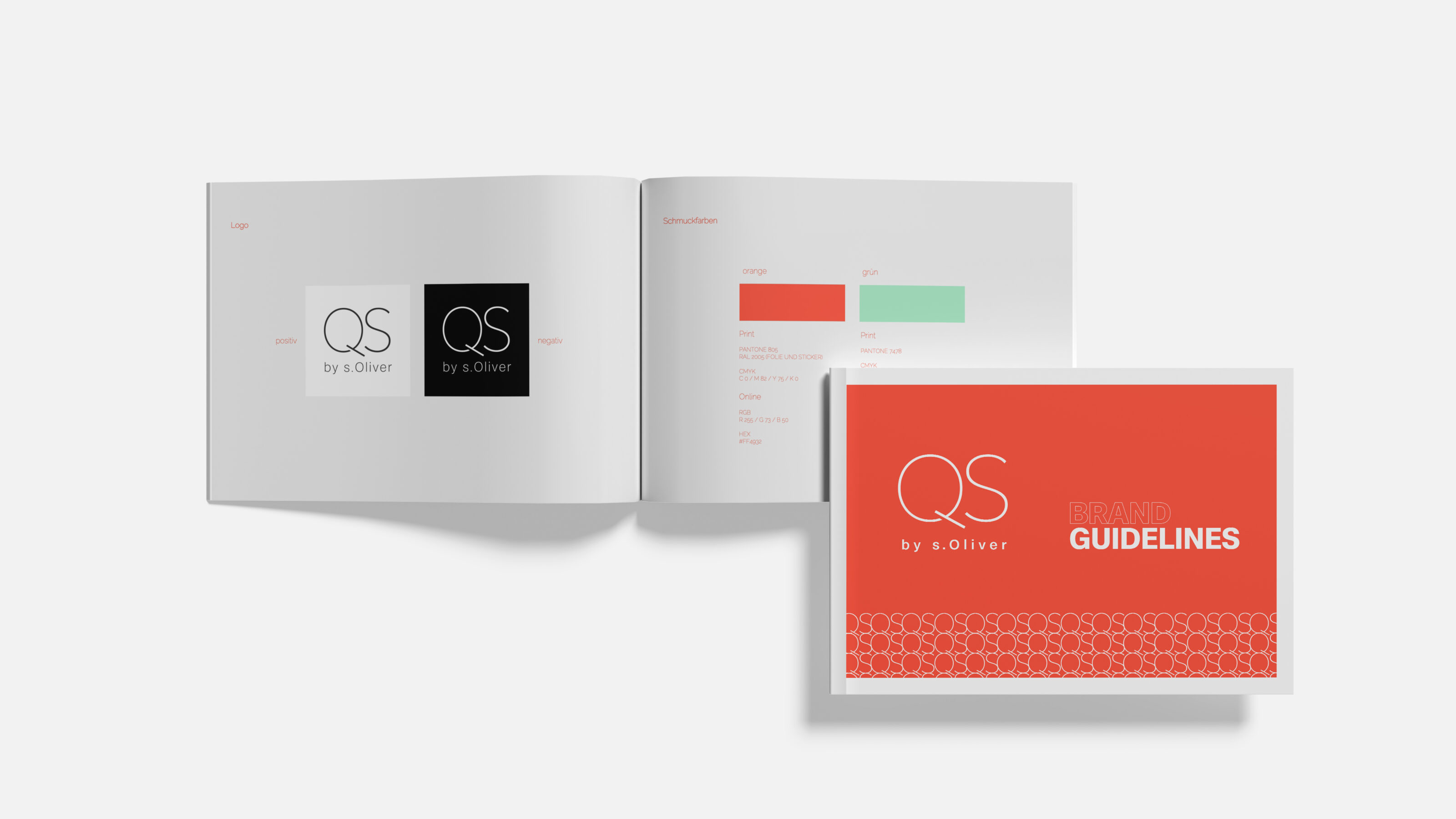
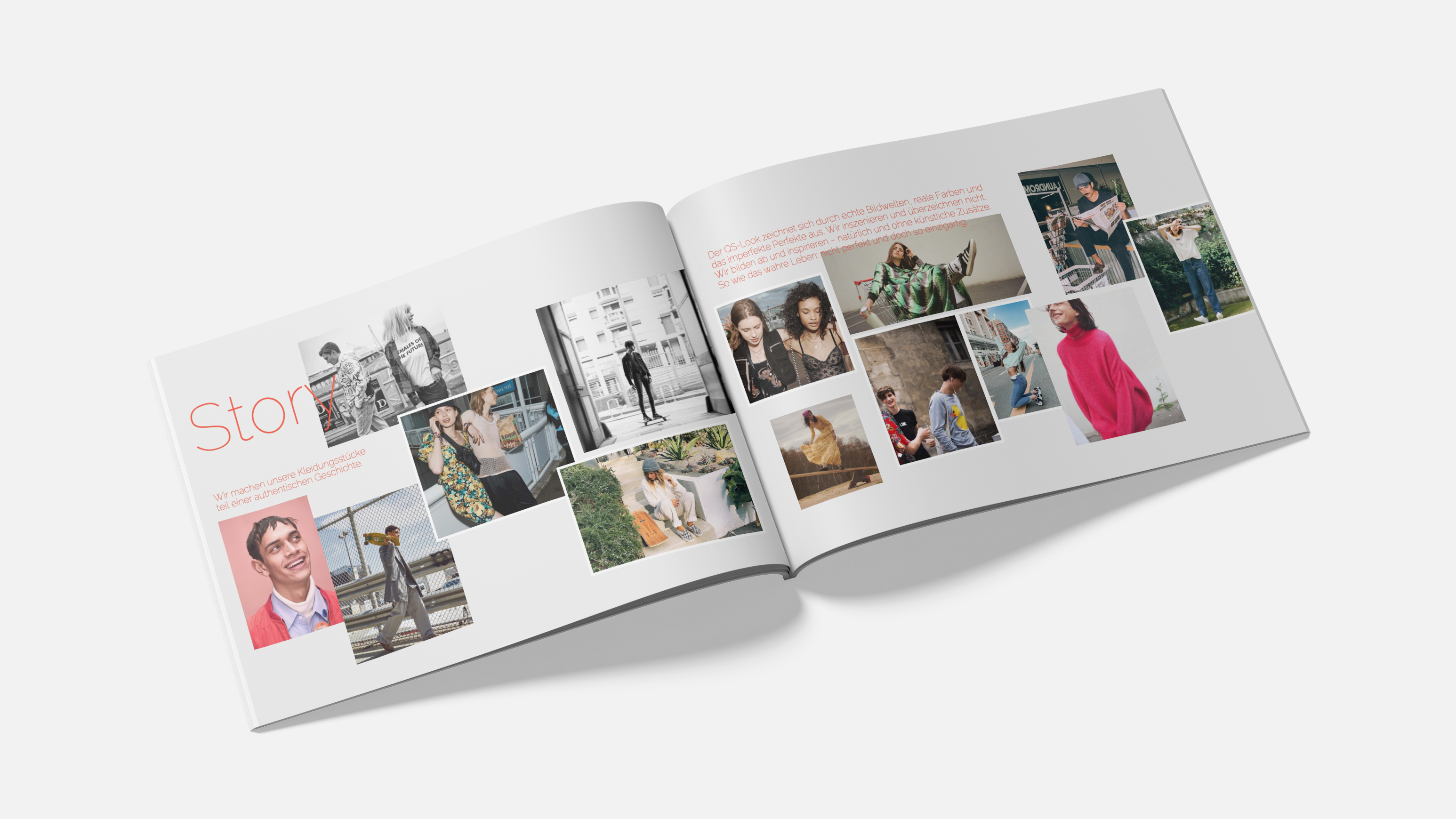
QS by s.Oliver was fundamentally redefined as an independent brand within the s.Oliver universe. Not as an extension, but as a clearly positioned voice with its own attitude, audience and cultural relevance. The starting point was strategic clarity. QS should not compete with the parent brand, nor borrow its codes. Instead, it needed a distinct emotional space shaped specifically for Generation Z. The foundation was built around mindset rather than demographics. Curiosity, spontaneity and everyday fun became defining brand drivers. Life as it happens, not as it should look. This thinking informed the entire brand system. From positioning and tone of voice to visual language, content logic and channel behavior. The design and CI were rebuilt from the ground up. A new logo designed for digital environments, a clearer typographic system and a visual world rooted in authenticity rather than perfection. Real moments. Diverse expressions. Imperfection as a conscious design choice. QS deliberately moved away from conventional fashion aesthetics. No borrowed looks. No interchangeable visuals. Instead, the brand claimed a cultural space that felt light, open and emotionally accessible. Communication was designed digital first from the beginning. Social media became the core brand stage, supported by selective out of home activations. Content followed a clear structure across awareness, participation and relevance, always rooted in cultural context. QS by s.Oliver was not refreshed. It was rebuilt as a Gen Z brand shaped by attitude, movement and connection. Fun is where you are.
Scope of work
- Strategy
- Creation
- Social Media
- Media